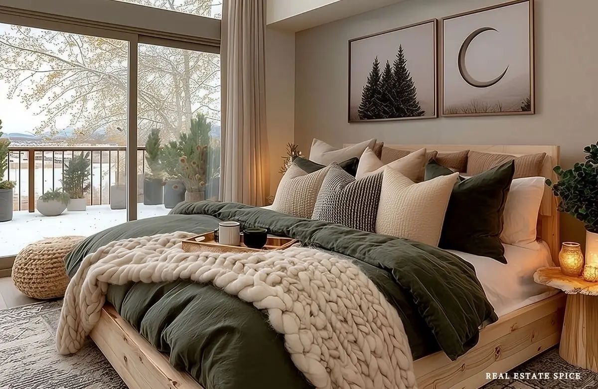
The Bedroom Color Rule of 3 to Create a Bedroom Retreat

Bedroom color can change the whole mood of your room before you buy new furniture, replace the bedding, or start blaming the curtains.
Sometimes the room doesn’t need more stuff.
It needs the colors to stop wandering off in five different directions.
It needs to come together so it’s a bedroom retreat that’s just simply perfect for you.
Be sure to check out The Bedroom Design Rule of 3 and Bedroom Trends This Year after this…

You might have bedding you like, a dresser that works, decent curtains, and wall art that should be helping.
But if the wall color, bedding color, and accent color aren’t working together, the whole bedroom can still feel off.
It may feel too stark, too dark, or too bland.
And it may not feel nearly as restful as you hoped.
That’s where the Bedroom Rule of 3 for color can guide you.
Instead of trying to choose every shade in the room at once, start with the three color choices that matter most.

Focus on your main wall color, your bedding color, and your accent color.
These three decisions shape the whole bedroom.
When those three colors support each other, your bedroom starts to feel calmer and softer.
It feels more personal, too.
And it starts to feel much more like the retreat you actually want to walk into.

Bedroom color does a lot more than sit on the walls and mind its business.
It changes how the whole room feels.
The right colors can make a bedroom feel fresh and airy, warm and grounded, romantic and moody, or soft enough to help you exhale at the end of the day.
The tricky part is that color doesn’t stay in one neat little corner.
It shows up on the walls, bedding, curtains, rugs, furniture, doors, lamps, artwork, and all those tiny accents that seem harmless until they start competing with each other.
That’s why choosing bedroom color one piece at a time can get messy fast.
A pretty wall color can feel wrong next to the bedding.
A beautiful accent color can suddenly look too loud with the curtains.
A neutral bedroom can feel flat if every shade has the same weight.
The Bedroom Rule of 3 keeps it simpler.
Start with the three color choices that carry the most visual weight, which I cover here.

When those three work together, the whole room feels more intentional without making the color palette feel complicated.
Once those colors are working, my neutral bedroom design formula can help you connect them with the furniture, contrast, pattern, and wall art throughout the room.
This article is part of the Bedroom Rule of 3 series, so we’re keeping the focus on color placement.
I’m not turning this into a full paint guide, bedding help, bedroom furniture formula, or bedroom decor help.
Instead, you and I are using one simple formula: main wall color, bedding color, and accent color.
I walk you through this here.
Grab your favorite beverage, pen, and paper for notes; take your time to study the images, design tips, and products, and enjoy!
ps…remember to save this and come back anytime for a dose of inspo!
What Is the Bedroom Rule of 3 for Colors?
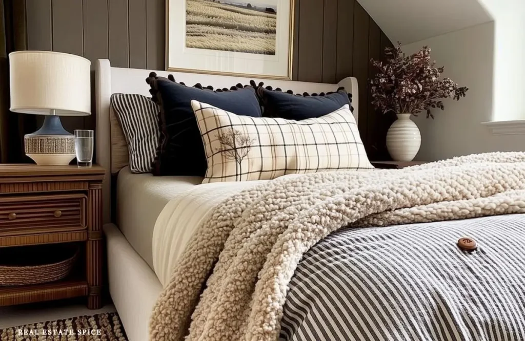
The bedroom rule of 3 colors formula is a simple way to make your bedroom color palette feel calmer and more pulled together.
You choose three main color decisions before you start buying more pieces or painting random surfaces.
Start with the main wall color, move to the bedding color, then choose one accent color.
Those three choices create the color structure of the room.
The wall color becomes the backdrop, the bedding creates the largest soft layer, and the accent color adds personality in smaller repeated places.
When those three decisions work together, the whole bedroom feels more intentional without needing a complicated design plan.
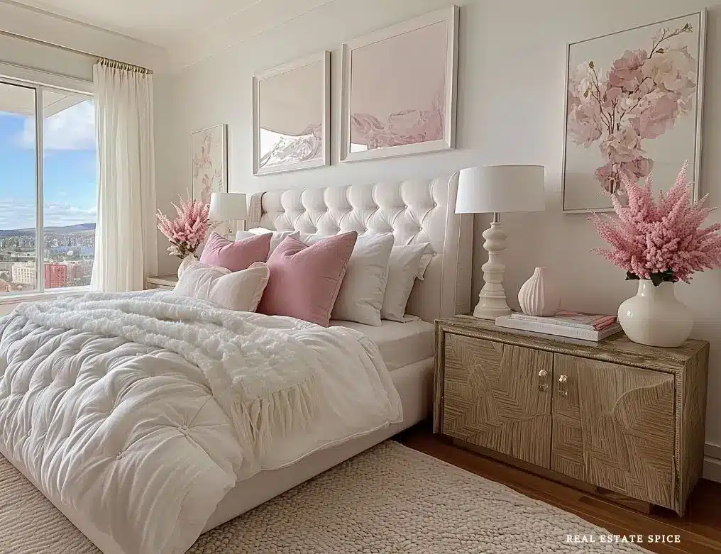
This framework works for neutral, earthy, or moody bedrooms.
It also works in small bedrooms, guest rooms, and spare bedrooms.
And yes, it can help when two people have very different opinions about paint.
It also helps when bedroom color ideas start blurring together.
Suddenly sage green, taupe, navy, blush, greige, and creamy whites all feel like one giant color cloud.
A lot of the colors are beautiful.
The real question is how they fit together in your bedroom.
Get My Free eBook
“100 Easy Ways To Refresh Any Room All Year Round”
Why Bedroom Color Works Better When You Decide Where Each Color Goes

Color feels more restful when it has a reason for being there.
A bedroom can include gorgeous paint colors and still feel off if the colors are spread around without a plan.
Maybe the walls are cool gray, the bedding is bright white, the curtains are cream, the rug is blue, the art is black, and the dresser is warm oak.
None of those pieces is wrong by itself.
Together, though, they may feel disconnected because the room lacks a clear color scheme.
That’s where color placement makes everything easier.
Before choosing anything, decide where the main color, bedding color, and accent color will actually land.
The wall color might be soft greige.
The bedding could be warm white or cream.
Then muted green can show up in pillows, art, or a painted bedroom door.
Suddenly the room has a plan.
The wall-bedding-accent triangle is another helpful way to think about it.
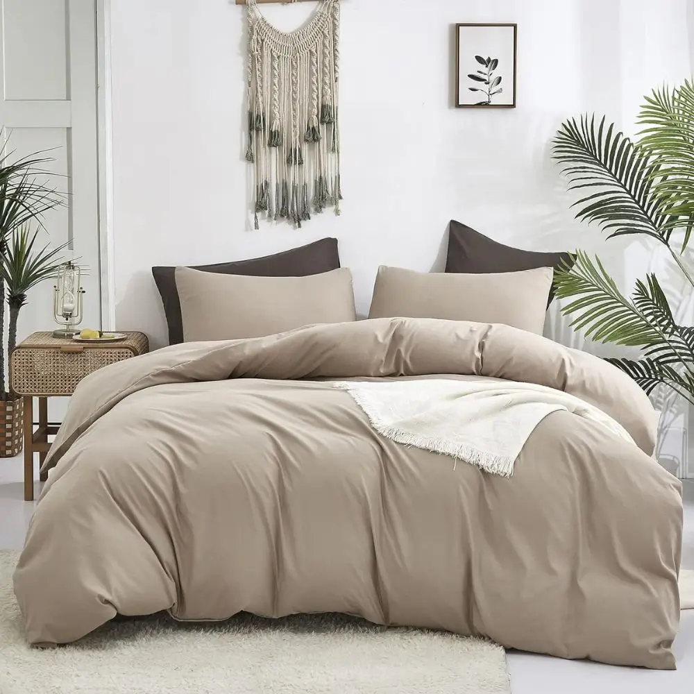
Let the wall color relate to the bedding.
Let the bedding connect with the accent color.
Then repeat that accent in a few small places.
You don’t need perfect matching.
You just need a color plan that feels calm, connected, and easy to follow.

There’s also the color volume dial.
Some bedrooms feel better with gentle, close colors, like cream, beige, taupe, and soft gray.
Others need more contrast, such as creamy walls with black accents or pale bedding against a navy wall.
The right dial setting depends on your light, furniture, room size, and the mood you want.
Priority 1: Main Wall Color

The wall color sets the largest color field in the room
Your main wall color is the biggest color decision in most bedrooms because it wraps around the whole space.
It shapes whether the room feels calm, warm, moody, fresh, earthy, romantic, or too intense.
Choosing the best color for bedroom walls isn’t just about finding a pretty paint chip.
It’s about choosing the backdrop your bedding, furniture, curtains, rugs, and art will sit against every day.
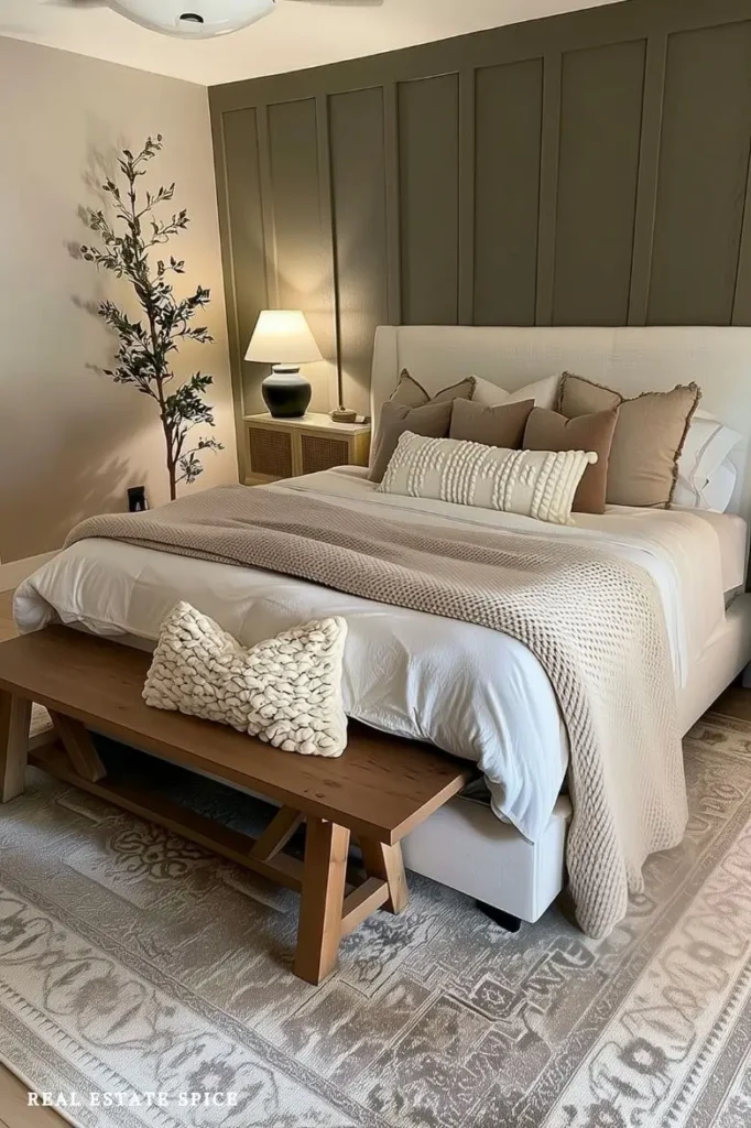
Bedroom wall color ideas can go in many directions, but the most restful choices usually have some softness to them.
Warm neutrals, creamy whites, greige, taupe, beige, and soft gray can all work beautifully.
So can sage green, muted greens, soft blues, delicate blue, and blush.
Charcoal, navy, and earthy tones can also feel restful when they’re balanced with softer colors.

The right choice depends on the room’s natural light and the feeling you want when you walk in.
Calming bedroom colors for adults often lean softer and more layered than bright.
That doesn’t mean your bedroom has to be pale or plain.
A green painted room can feel grounded and soothing, while a navy bedroom can feel rich and cocoon-like.
Charcoal can feel dramatic and restful when it’s balanced with lighter bedding.

Even a black paint room can be stunning in the right space, especially with soft lamps, textured bedding, and warm wood tones.
Choose the wall color by mood, not just trend
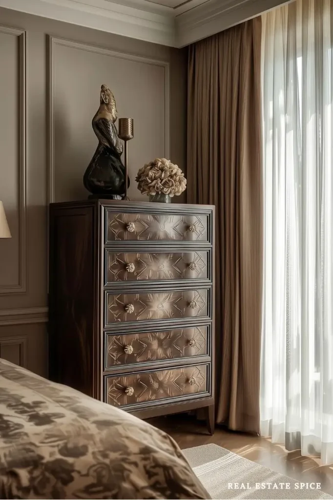
Bedroom colors and moods are deeply connected.
A fresh bedroom may feel better with creamy white, pale blue, or a soft warm neutral.
A cozier bedroom may call for taupe, greige, muted green, terracotta, or mushroom tones.
Modern bedroom color ideas can use warm white, charcoal, black accents, soft gray, or deep navy.
Once you find colors you love, use this modern bedroom design formula to connect them with the furniture, lighting, and decor.
A more romantic bedroom might lean into blush, mauve, creamy beige, or a muted rose-brown.

Master bedroom color ideas often work best when they feel restful enough for everyday life but personal enough to feel like your retreat.
Guest bedroom color ideas usually do well with easygoing colors like warm white, sage, soft blue, beige, or greige because they’re comfortable for many people.
Small bedroom color ideas may need a lighter touch if the room has limited light.

Though a small room can absolutely handle a deeper shade when the bedding and accents balance it well.
There isn’t a single best bedroom color for sleep because every room and person is different.
If you’re still choosing your shades, this article on calming bedroom colors will help you consider your light, furniture, and personal response to color.
Still, many relaxing bedroom colors tend to be softer and lower contrast.
If a shade feels too sharp in the morning, it may feel even less restful at night.
Test the wall color in your actual room

Paint samples matter.
Peel-and-stick samples are useful because you can move them near the bed, windows, dresser, and curtains.
A wall color app can help you picture a direction, but use the wall color app reality check.
Digital previews are helpful for ideas, not final decisions.
Always test real samples in the actual room.
The nighttime sample test is especially important in bedrooms.
You may use the room most at night, so check paint samples and bedding colors in evening light.
A color that looks perfect at noon can turn colder, darker, or greener under lamps.
Place the sample near your bedding, furniture, and curtains so you can see how the whole palette looks together in the room.
If you’re unsure, try a main wall color that gives you flexibility.
Creamy whites, warm neutrals, greige, taupe, and soft blue-gray tones let bedding and accents shift over time without forcing a full bedroom makeover later.
Priority 2: Bedding Color

Bedding color is the largest soft color layer
Bedding color matters because the bed usually takes up a huge part of the visual space.
The wall color may be the backdrop, but the bedding is the soft layer you notice right away.
It can calm the walls, add contrast, warm up furniture, or bring the room into balance.
The focus here is on color balance.
Your duvet cover, comforter, quilt, coverlet, throw pillows, and blankets should connect the wall color with the rest of the room.

The bedding bridge idea is helpful here.
Use bedding to connect the wall color with your furniture tones.
If you have oak furniture, bedding in cream, green, blue, terracotta, or warm neutrals can make the wood feel intentional.
Black furniture often softens beautifully with cream, taupe, sage, muted blue, or textured white bedding.

White furniture can feel warmer with beige, blush, warm gray, soft green, or woven textures nearby.
Use bedding to soften or strengthen the walls

White bedding can look fresh and beautiful, especially against warm walls, painted trim, or deeper colors.
If white bedding feels too stark, shift toward cream, oatmeal, ivory, or warm white.
Cream bedding against a soft gray wall can create a calm cream and gray bedroom without feeling cold.
Warm white bedding with beige or taupe walls can make a neutral bedroom feel soft and restful.

Muted bedding is another excellent choice when you want the room to feel calmer.
Try muted green with neutral walls for an earthy, relaxed feeling, or soft blue bedding with creamy walls for a peaceful look that doesn’t go overly sweet.
Patterned bedding can work well too, especially when the wall color is simple, and the pattern includes colors already used elsewhere in the room.
Darker bedding can be beautiful against lighter walls.

Charcoal, navy, forest green, chocolate, or deep taupe bedding can make a room feel grounded.
Just give those deeper colors some softness through texture so the bed doesn’t feel too heavy.


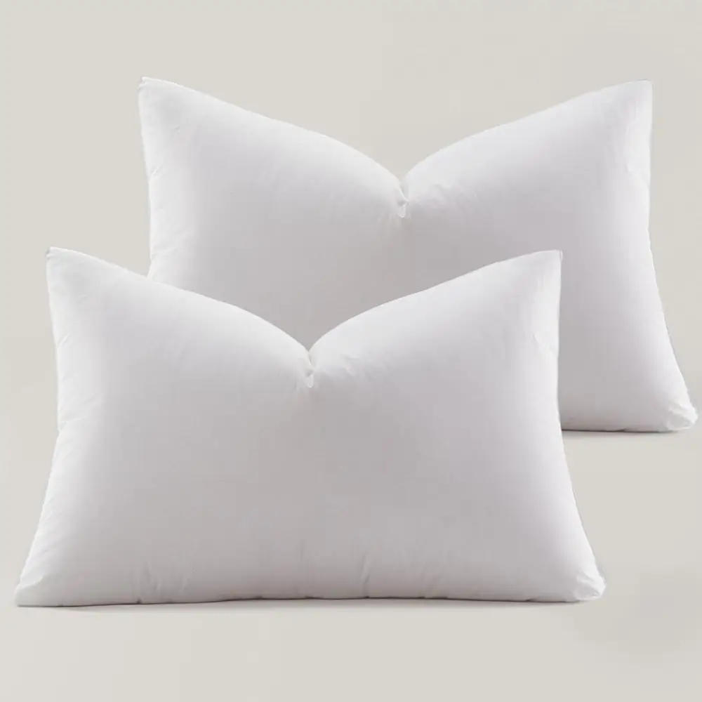
Globan Hotel Collection Down Feather Pillow (A Splurge But Worth It)

Think about bedding color by bed size and room size

A king bed carries a lot of color, so king bedding can shift the whole room dramatically.
If the room is already dark, lighter bedding can bring relief.
When the walls are light and the room needs depth, a slightly deeper duvet or quilt can help.
Queen bedding often needs balance because the bed may sit in a smaller room.
Keep the color full enough to feel cozy but not so strong that the bed overwhelms the space.

Twin bedding or daybed bedding can carry color in a smaller way, which is useful in kids’ rooms, guest rooms, or spare bedrooms.
For twin beds, use bedding color to tie two beds together without making everything match exactly.
On a daybed, the bedding color may also need to work with the seating function.
Bedroom color ideas for adults usually work best when bedding feels restful and not overly busy.
That can mean tonal bedding, white bedding with texture, a soft patterned quilt, or a muted duvet cover.
Priority 3: Accent Color

Accent color gives the room personality
Accent color is the small-but-powerful color that makes the bedroom feel personal.
It might show up in throw pillows, blankets, curtains, lamps, wall art, rugs, dresser styling, mirrors, trim, closet doors, or a painted bedroom door.
The key is that the accent color should appear on purpose, not pop up randomly in five unrelated places.
A pillow test for accent color is a great low-risk move.
Try an accent color first through throw pillows or a blanket before committing to paint, curtains, or a rug.

If muted green pillows make the room feel better, you might bring that same green into art or a painted door.
When blush feels too sweet after a few days, you’ve learned that before painting anything permanent.
The pillow gave you the answer.
Thank you, pillow.
Accent colors can be soft or strong.

Sage green, dusty blue, terracotta, navy, charcoal, black, brass, blush, rust, and warm brown can all work depending on the room.
Black accents can sharpen a pale bedroom, brass can warm up a cool palette, and terracotta adds earthiness.

Use accent color in repeated landing spots

One accent can feel accidental.
Two or three repeated accent landing spots feel intentional.
For example, muted green could appear in a pillow, a piece of wall art, and a small lamp base.
Black might show up in picture frames, curtain rods, and a mirror.
Brass could repeat in lamps, drawer pulls, and a picture light.
The accent color should support the wall-bedding-accent triangle.
If your walls are creamy white and your bedding is soft blue, a brass or warm wood accents may make the room feel warmer.
With sage walls and ivory bedding, black accents can give the room definition.
When your walls are greige and bedding is cream, terracotta or muted rust can add warmth without taking over.
This is where bedroom wall decor, lamps, rugs, curtains, and dresser styling help.
Let the bedroom door become the accent
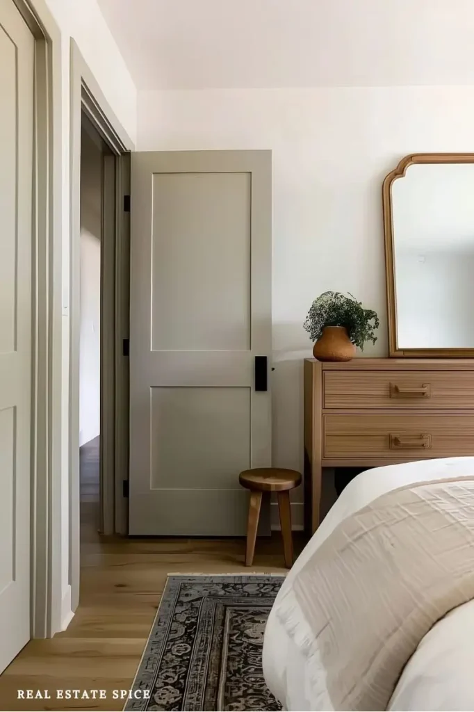
Bedroom door color ideas can be surprisingly powerful because the door is already a clear surface.
The one-step darker door is a beautiful option.
Paint the bedroom door or closet doors one shade deeper than the wall color for a subtle accent.
A warm taupe door with creamy walls can look polished.

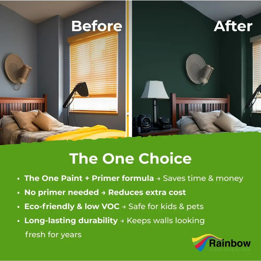
This paint is perfect for a one-coat job. It goes on smoothly and dries quickly too!
Dusty blue can soften a neutral room, and muted green closet doors can add character without making every wall green.
Soft black can also work, especially if the room has black accents elsewhere.
Charcoal, deep greige, muted navy, and earthy green can create the same effect in different moods.

If you rent, use the same idea through art, bedding, or a small accent piece.
How to Use This Bedroom Color Formula in a Small Bedroom

Small bedroom colors work best when the room doesn’t feel chopped into too many separate color blocks.
That’s where the small bedroom low-contrast trick helps.
Use wall and bedding colors with a similar color value, then add one smaller accent so the room still has personality.
For example, creamy walls with ivory bedding and muted green accent colors or gold accent colors can make a small bedroom feel soft and connected.
Greige walls with warm white bedding and black accents can feel modern without feeling harsh.
Soft blue walls, cream bedding, and wood tones can create a restful, airy space.
Small bedroom colors don’t have to be pale, but deep colors need balance.
If you choose navy, charcoal, or a deeper green, use lighter bedding and warm lighting so the room still feels restful.
How to Use This Bedroom Color Formula in a Primary or Master Bedroom

Master bedroom color ideas can have more depth because the room is often larger and more personal.
You might use a main wall color like warm taupe, soft green, charcoal, navy, or creamy white.
Then choose bedding that either softens or contrasts that backdrop.
Accent color can come through lamps, curtains, art, rugs, or a painted door.
For a calm master bedroom, try warm neutral walls, cream bedding, and sage or brass accents.
If that palette sounds divine, these neutral bedroom ideas will show you how to add warm wood, upholstered furniture, layered bedding, and deeper accents.
A more dramatic primary bedroom might use charcoal walls, ivory bedding, and warm wood details.
Bedroom color ideas for couples often benefit from this formula because it gives both people a say without turning the room into a tug-of-war over one paint chip.
How to Use This Bedroom Color Formula in a Guest Bedroom or Spare Bedroom
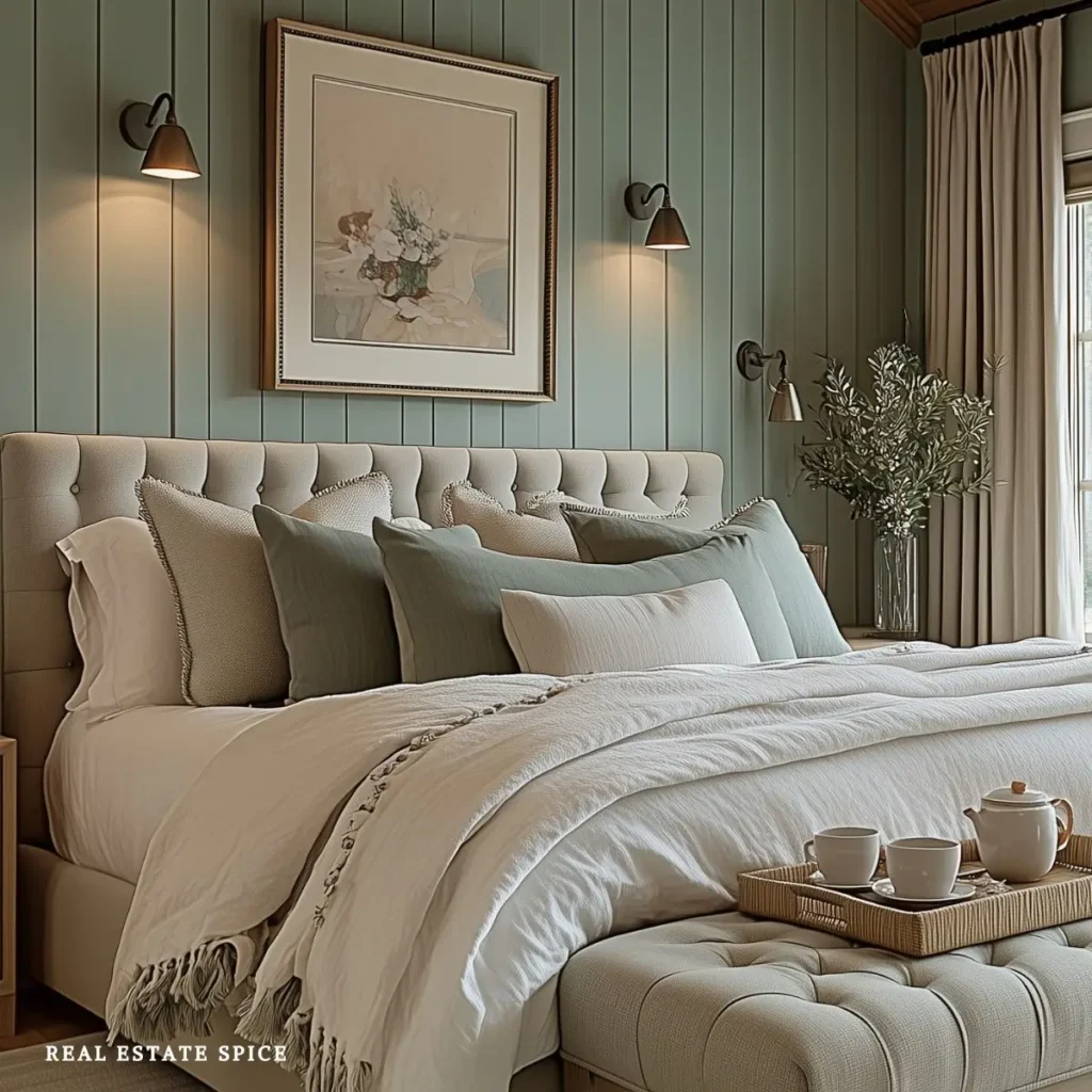
Guest bedroom color ideas usually work best when they feel restful and flexible.
You don’t have to make the room completely neutral, but easygoing colors work well.
Creamy whites, soft blues, warm beige, sage green, greige, and muted earth tones are strong choices.
Spare bedroom color ideas need to account for how the room is actually used.
If the room doubles as an office, you may want a wall color that feels fresh during the day and restful at night.

A daybed or guest bed can use bedding color to connect both functions without locking the room into one purpose.
How to Use This Bedroom Color Formula for Couples

Bedroom color ideas for couples can get tricky when one person wants soft and airy while the other wants dark and moody.
The couples’ color compromise can help.
Use a neutral wall color, a bedding color both people like, and one accent color with personality.
For example, warm greige walls, cream bedding, and navy accents can feel balanced.
Creamy white walls, muted green bedding, and black accents can work for many styles.
Taupe walls, white bedding, and brass or terracotta accents can feel warm without leaning too far in one direction.
This paint is perfect for a one-coat job. It goes on smoothly and dries quickly too!
This formula also helps with bedroom color ideas for men.
It also works with bedroom color ideas for women.
Instead of leaning on stereotypes, it focuses on the mood you want the room to have.
Do you want warm, restful, modern, earthy, romantic, fresh, or dramatic?
That question is much more useful.
Color is only one part of designing a room for two, so use the complete bedroom design for couples formula to connect your color choices with comfort, storage, lighting, and daily routines.
How to Use This Bedroom Color Formula in Kids’ Rooms

Kids bedroom color ideas can still use the same rule of 3.
Choose a main wall color, a bedding color, and one accent color.
The room can feel playful without becoming overly themed.
Boys bedroom color ideas might use soft blue walls, cream bedding, and rust or navy accents.
Girls bedroom color ideas could use creamy walls, blush bedding, and sage green accents.
Bedroom color ideas for girls can also use lavender, soft green, peach, warm white, or delicate blue.
A flexible room can keep the walls neutral and use bedding and accents for personality, so the space can grow over time.
How to Choose Bedroom Colors if You Have Black, White, Oak, or Mixed Bedroom Furniture
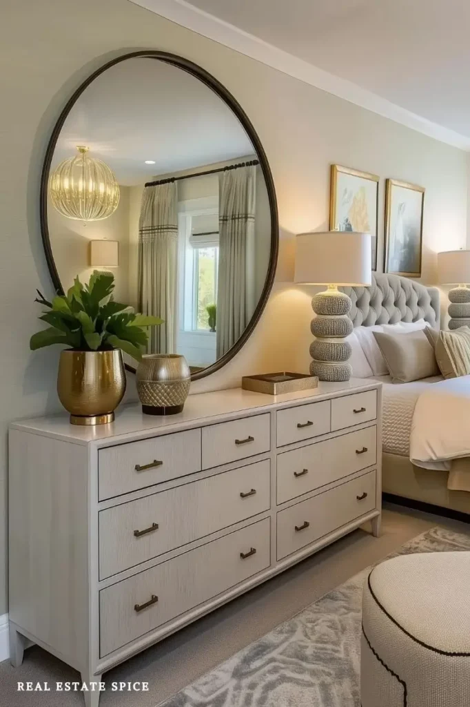
Bedroom furniture color ideas matter because furniture changes how paint and bedding read.
The black furniture softener is helpful when the room has black bedroom furniture.
Soften black pieces with cream, taupe, warm white, sage, muted blue, or textured bedding.

Add wood tones, or gold or brass accents for warmth.
The white furniture warmer works when you have white bedroom furniture.
Add beige, blush, soft green, warm gray, woven textures, or wood accents so the room doesn’t feel too stark.
The oak furniture bridge is especially useful.
If the room has oak bedroom furniture, choose colors that work with the wood tone instead of fighting it.
Cream, green, blue, terracotta, taupe, and warm neutrals often pair beautifully with oak.
Mixed furniture can work too if the wall color and bedding help connect the pieces.
Bedroom Door Color Ideas and When the Door Can Become the Accent
A painted bedroom door can add accent color without changing the whole room.
This works especially well when the walls are neutral and the bedding is soft.
A door in muted green, dusty blue, warm taupe, soft black, or a deeper version of the wall color can make the room feel more custom.

Closet doors can do the same thing, especially in rooms with large closet fronts.
If painting all the doors feels like too much, try the pillow test for accent color first.
Bring the color into a throw pillow, blanket, or small piece of art before committing to paint.
Bedroom Color Mistakes That Make a Room Feel Less Restful

Choosing paint before checking bedding and furniture
Wall paint looks different next to oak, black, white, and mixed finishes.
Test the color with the pieces already in the room before committing.
Using too many accent colors
One accent color repeated in a few places usually feels calmer than several unrelated accents scattered around the room.
Ignoring evening light
Bedrooms are often used most at night, so the sample at night test matters.
Paint and bedding colors can shift under lamps.
Making a small bedroom too choppy
Strong contrast can work, but too many high-contrast breaks can make a small bedroom feel smaller.
Use the low-contrast trick when the room needs softness.
Choosing a trendy color that doesn’t match the mood you want
A color can be stylish and still wrong for your room.
Start with the feeling first, then choose paint colors, bedding colors, and accents that support it.
Forgetting that bedding carries a lot of color
The bed is usually large, so bedding color changes the room more than small accents.
Treat it as part of the color plan.

When the Colors Finally Let the Room Exhale

Bedroom color isn’t about picking one pretty paint chip and hoping the whole room magically works.
It’s about choosing a main wall color, a bedding color, and an accent color that support one another.
When those three choices connect, the bedroom feels calmer, softer, more personal, and more like a retreat.
Start with the wall color as your backdrop.
Choose bedding that softens, balances, or deepens that backdrop.

Add one accent color in a few intentional landing spots.
That’s the bedroom rule of 3 colors framework, and it makes the whole process feel much easier.
Your room doesn’t need every beautiful color you’ve ever saved.
It needs the right colors in the right places.
Once that happens, the bedroom starts to feel warmer, more restful, and much more like a space you can truly sink into at the end of the day.