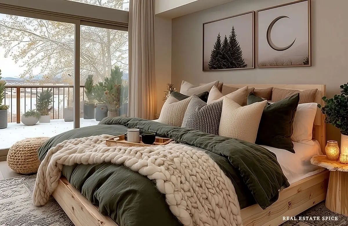
Calming Bedroom Colors: Discover Which Shades Help You Unwind—and Why

Some bedroom colors look beautiful on a paint card and become overwhelming once they cover four walls.
Others seem ordinary elsewhere, then turn soft, warm, and wonderful beside your bedding at night.
The difference isn’t simply the name printed on the color sample.
Be sure to check out the Bedroom Color Rule of 3 and these Relaxing Bedroom Sanctuary Ideas after this…
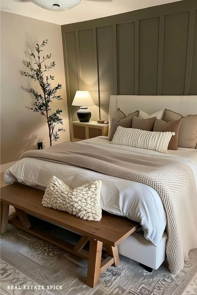
Color is personal.
The same sage green may help one person settle in and create a calming bedroom retreat.
It may remind someone else of a school hallway, an old apartment, or the kitchen they spent ten years trying to update.
Blue can look open and restful in one bedroom, yet cold and distant in another.
Cream can glow beautifully at sunset or turn a little too yellow under the wrong lamp.
That doesn’t mean color psychology is useless.
It means the most helpful question isn’t, “Which color is calming?”
The better question is, “Which color helps me unwind in this bedroom?”

As I work toward my doctorate in psychology, with a focus on people and their environments, I keep returning to the two-way relationship between us and the spaces we create.
Our surroundings affect what we notice, how comfortable we are, and what we do there.
At the same time, our memories, preferences, routines, and current needs shape the spaces we create.
Bedroom color is a wonderful place to see that relationship because paint never appears alone.
You experience it with the light, furniture, bedding, textures, views, memories, and time of day.
Here, I help you look at all of those pieces together.
You won’t leave with a rigid chart telling you that every blue is peaceful and every red is plotting against your sleep.
You’ll leave with a better way to choose calming bedroom colors that suit you, your room, and the way you want to end the day.
Grab your favorite beverage, pen, and paper for notes; take your time to study the images, design tips, and products, and enjoy!
ps…remember to save this and come back anytime for a dose of inspo!
Why the Same Bedroom Color Can Relax One Person and Annoy Another

Color psychology is often presented as though every shade arrives with one permanent emotional label.
Blue is calm.
Yellow is happy.
Green is balanced.
Real people are much more interesting than that.
Research does find broad patterns in the way people connect colors with emotions.
A large study involving participants across 30 countries found many shared color-emotion associations, along with meaningful differences related to language, geography, and culture. Psychological Science
That helps explain why a color can carry a familiar mood without affecting everyone in exactly the same way.
Another line of research suggests that our color preferences are partly connected to the things we associate with those colors.
The researchers found that people tended to prefer colors connected with things they already liked. Proceedings of the National Academy of Sciences
You may love the blue of clear water because it brings back a favorite trip.
Someone else may avoid that same blue because it reminds them of a workplace they couldn’t wait to leave.
Personal history comes into the room with you.
That’s why your response to a color deserves more weight than a generic list on the internet.
Get My Free eBook
“100 Easy Ways To Refresh Any Room All Year Round”
But, Jaymie, Isn’t Blue Supposed to Be Calming?
It can be.
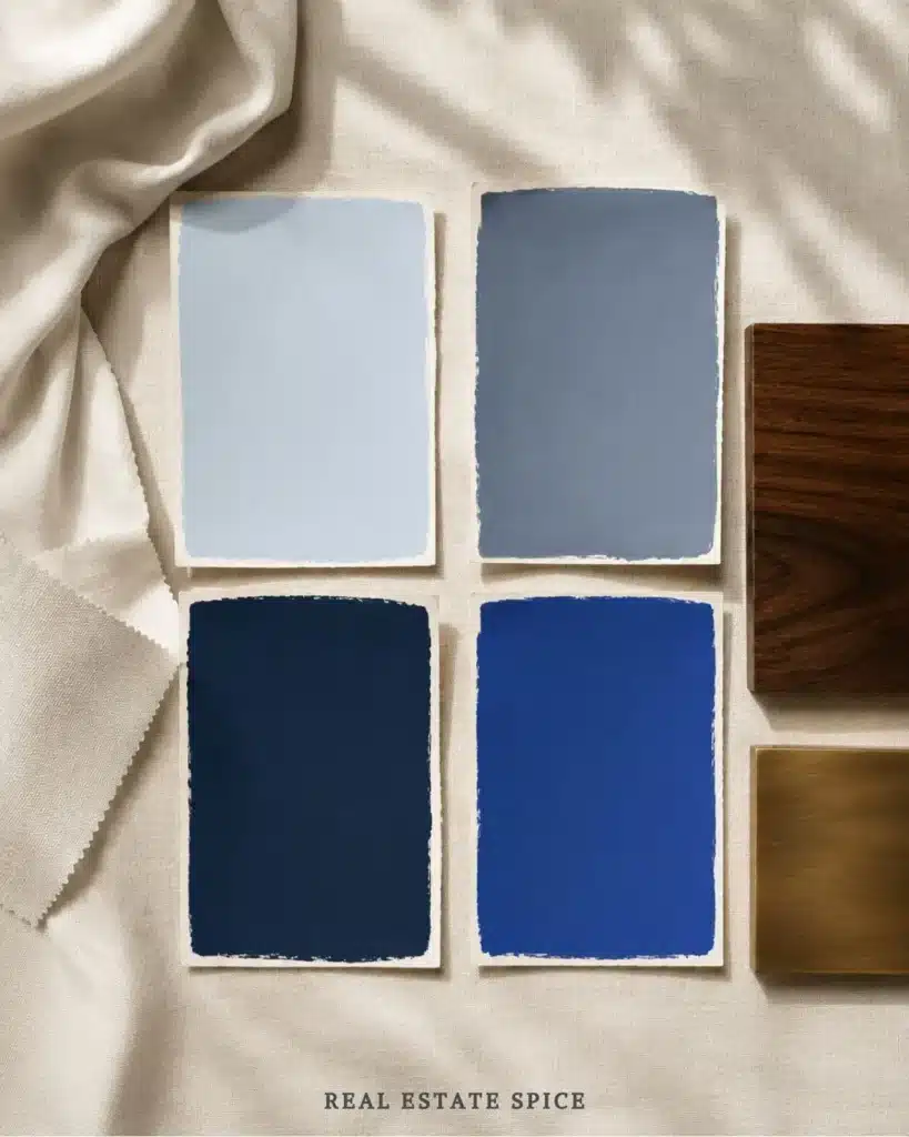
Soft blue, smoky blue, blue-gray, and deep navy can all create beautiful bedrooms.
But the word blue covers everything from a pale morning sky to an electric sports-car finish.
Those don’t bring the same energy to bedtime.
Hue is only one part of the experience.
Brightness and saturation matter, too.

In controlled color studies, brighter and more saturated colors have often produced different emotional responses than softer versions of the same general hue. PubMed
That doesn’t mean a saturated color is bad.
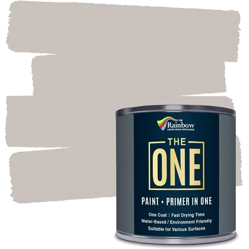
This paint is perfect for a one-coat job. It goes on smoothly and dries quickly too!
It means a vivid cobalt wall will have more visual presence than a misty blue-gray wall.
Your bedroom may welcome that richness, or it may start looking as though the paint has volunteered to be the alarm clock.
The Room Changes the Color
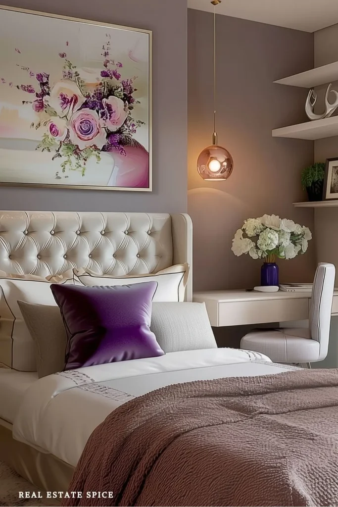
A paint sample isn’t a promise.
It’s a starting point.
Color changes beside warm wood, black furniture, white bedding, cream curtains, and gray carpet.
It changes when morning sun crosses the room.
It changes again when you turn on your lamps at night.
Research done with small color samples can teach us something, but it doesn’t always predict how people respond to color inside a furnished room.
One study using hotel-room settings found that responses inside an interior did not neatly match results from simpler color-chip studies. International Journal of Hospitality Management
That is very useful for decorating.
It reminds us to stop treating one paint chip like it has all the answers.
Choose the Bedroom Experience You Want at the End of the Day
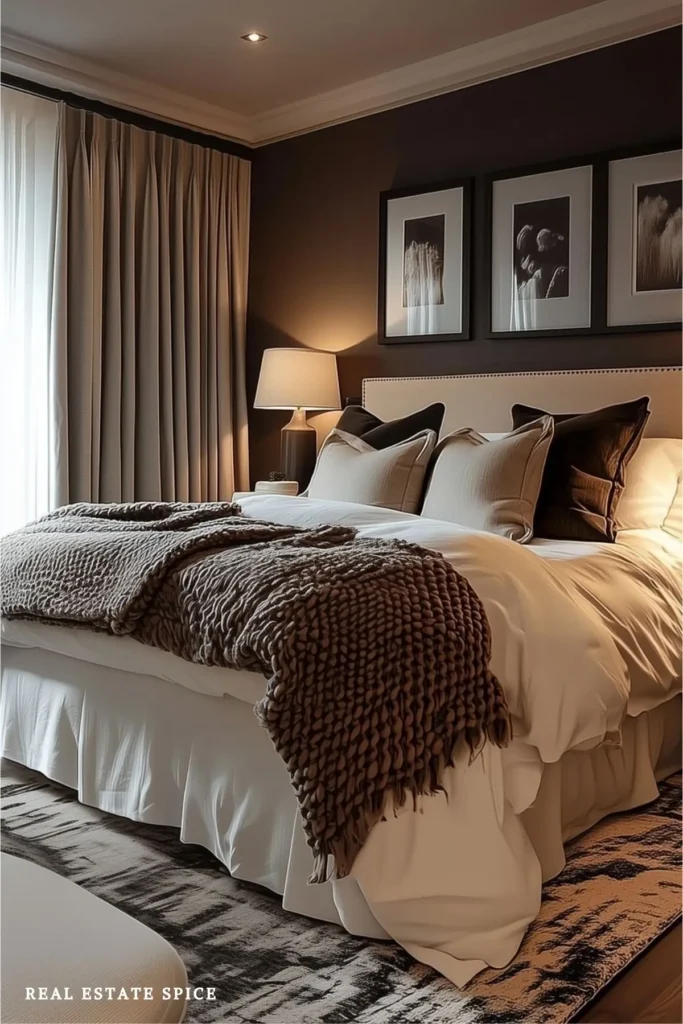
Before you choose a paint color, picture the last hour of an ordinary day.
You aren’t staging for a photo or preparing for company.
You’re putting away your clothes, lowering the lights, climbing into bed, and trying to let the rest of the day go.
What would support that routine?
You may want the room to look airy and open because the rest of your house has a lot of visual activity.
You may want warmth because the bedroom currently looks a little cold and unfinished.
You may prefer a deeper, cocoon-like room that separates nighttime from the brightness of the day.

You may want nature-connected colors because greens, browns, clay tones, and wood make the room more comfortable for you.
Use plain language.
“Light, warm, and easy” is much more useful than trying to name a decorating style you don’t actually care about.
“Dark, soft, and cozy” gives you a clear direction.
“Fresh, natural, and not too beige” works perfectly well, too.
You aren’t writing a design manifesto.
You’re trying to avoid bringing home twelve paint samples that all look exactly the same by Tuesday.
When Two People Respond Differently to the Same Color
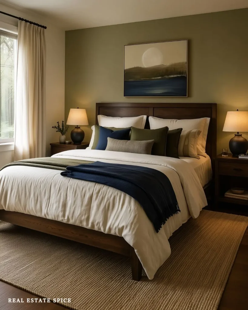
A couple’s bedroom doesn’t require both people to love every color equally.
It needs a direction neither person dreads seeing across from the bed each morning.
TRY THIS TOGETHER
Let Each Person Choose First
Each of you save three bedrooms you’d happily sleep in. Compare the colors, wood tones, bedding, and lighting the rooms share before choosing paint. The shared pattern is your starting point.
You might discover that one person saved navy and the other saved olive, but both rooms used cream bedding, dark wood, and warm lighting.
That shared pattern is more useful than deciding one of you is “the blue person” forever.
Look for agreement in the depth, warmth, and contrast before choosing an exact shade.
If one person wants a dark room and the other wants a light one, use the deeper color in a contained place.
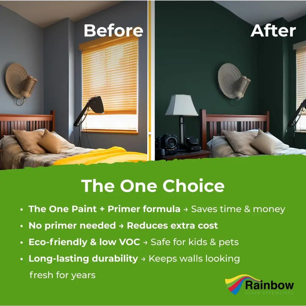
It could appear behind the bed, on the bedding, or through curtains and larger accents.
Then keep the surrounding walls warmer and lighter.
That gives the room personality without making either person wonder when their half of the bedroom is arriving.
Calming Paint Colors for Bedroom Walls

The best calming paint colors for bedroom walls are soft enough to make the whole room easier to settle into, without grabbing your attention every time you walk in.
That softness can come from muted undertones, lower saturation, warm materials, or gentle contrast.
It does not mean every relaxing bedroom has to be pale.
A deep green bedroom can be restful.
A navy bedroom can look wonderful at night.
A warm cream bedroom can feel enveloping without being dark.
The best color depends on the experience you want and the furniture, bedding, and decor that will stay in the room.
Deep Blue and Blue-Gray for a Moody, Restful Bedroom
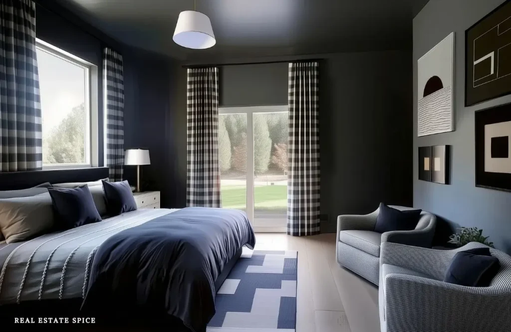
Deep blue and blue-gray can create a more cocoon-like bedroom without using black or a very dark brown.
These colors work especially well if you like a bedroom that feels a little moodier at night.
Keep the bedding softer so the room doesn’t become too heavy.
Warm white, cream, soft gray, natural wood, and brass all look beautiful beside deep blue.
If you use blue-gray on the walls, look at it in both daylight and lamplight before committing.
A shade that looks calm in the afternoon may look much darker once the sun goes down.
You don’t need to match every blue exactly.
A few nearby shades, paired with warm materials, will give the bedroom depth without making it look overly coordinated.
Soft Blue and Blue-Gray for an Open, Restful Bedroom

Soft blue works well when you want the bedroom to look fresh, spacious, and easy on the eyes.
Choose a blue with a little gray when clear sky blue looks too bright for your furniture or light.
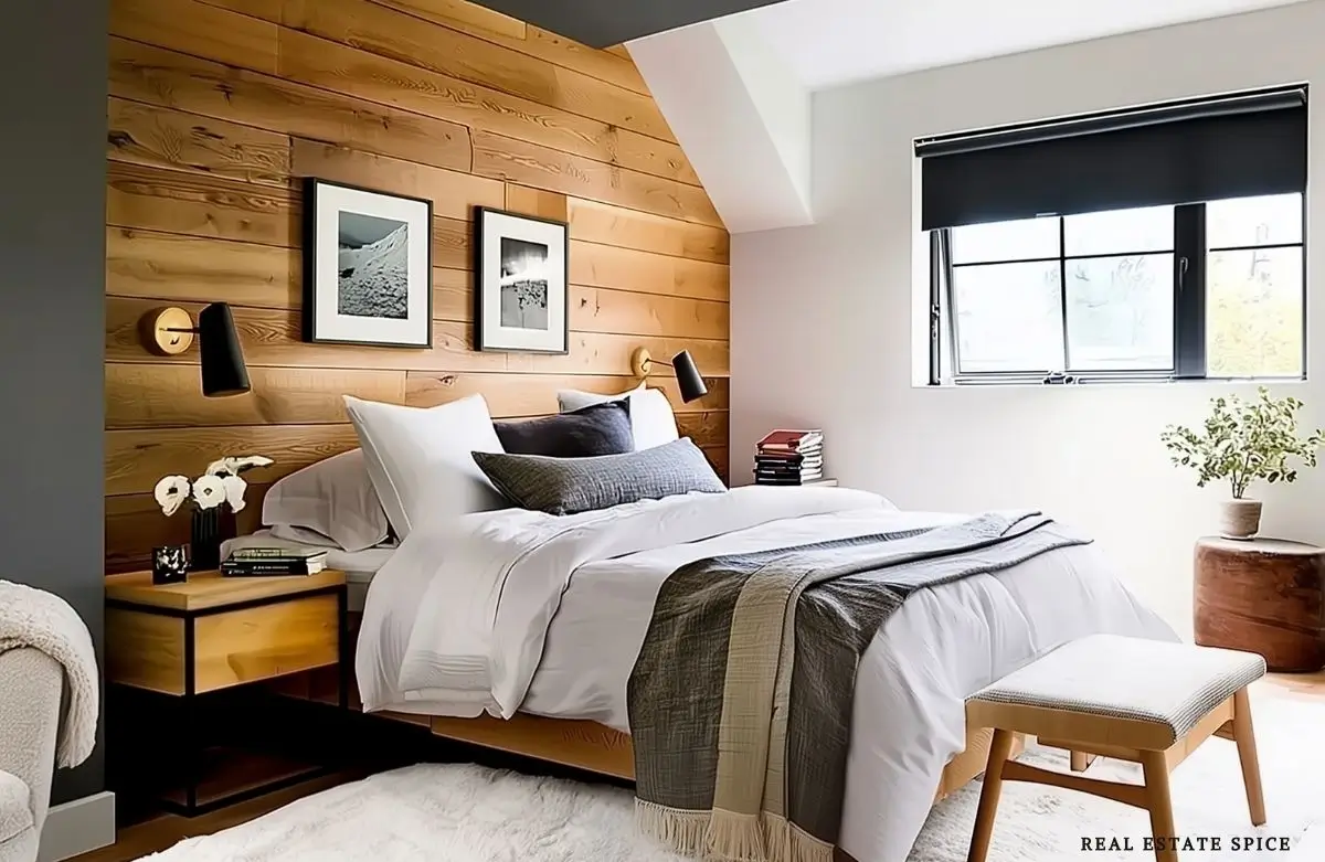
Blue-gray can pair beautifully with warm white bedding, natural wood, taupe, charcoal, and touches of brown.
Warm wood is especially helpful because it keeps a cool blue bedroom from becoming icy.
If the room faces north or receives limited natural light, test blue very carefully.
A delicate blue that looked dreamy online may become chilly in your actual bedroom.
Try it beside the headboard, curtains, flooring, and bedding before you decide.
When you want a deeper room, smoky navy can give you color without the sharpness of a brighter blue.
Balance it with cream, camel, warm oak, walnut, or soft brass so the entire room doesn’t drift toward cold.
Sage, Olive, and Muted Green for a Nature-Connected Bedroom
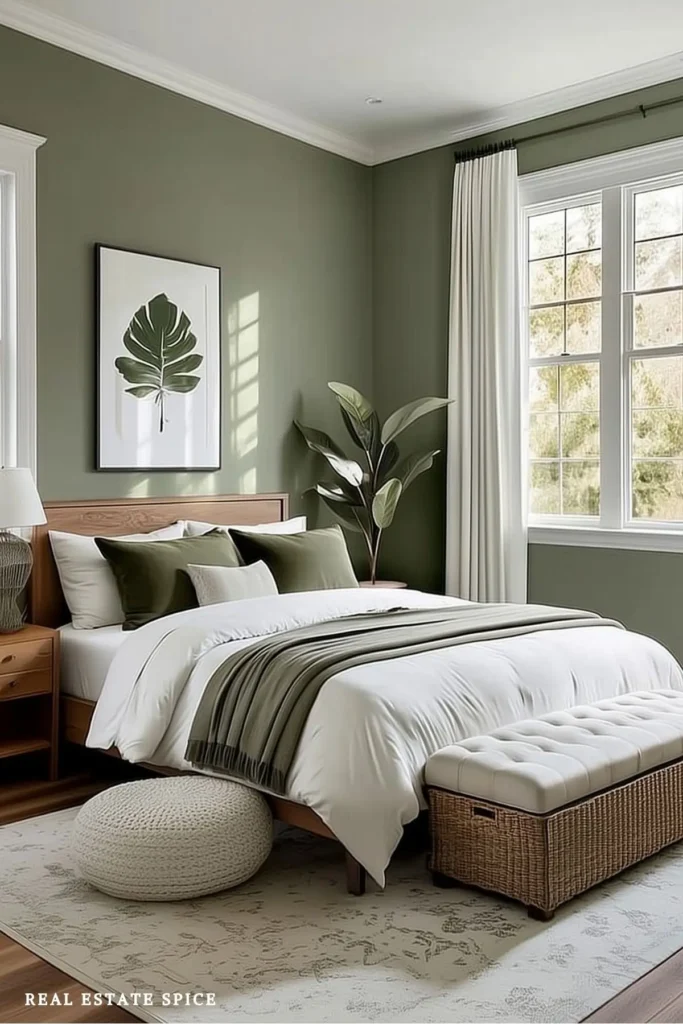
Green is one of my favorite directions for a bedroom because there are so many beautiful ways to use it.
Sage can look light and gentle.
Olive adds warmth and depth.
Forest green can create a darker, more enveloping room.
The key word is muted.
A green with gray, brown, or softened yellow undertones usually settles more easily into a bedroom than a sharp, highly saturated green.
Pair it with cream bedding, warm wood, woven textures, black accents, or aged brass.
If you love sage green bedroom ideas and earthy palettes, keep going with my earthy bedroom decorating ideas and tips.
It will help you carry those natural colors through the rest of the room.
Green also changes dramatically with daylight.
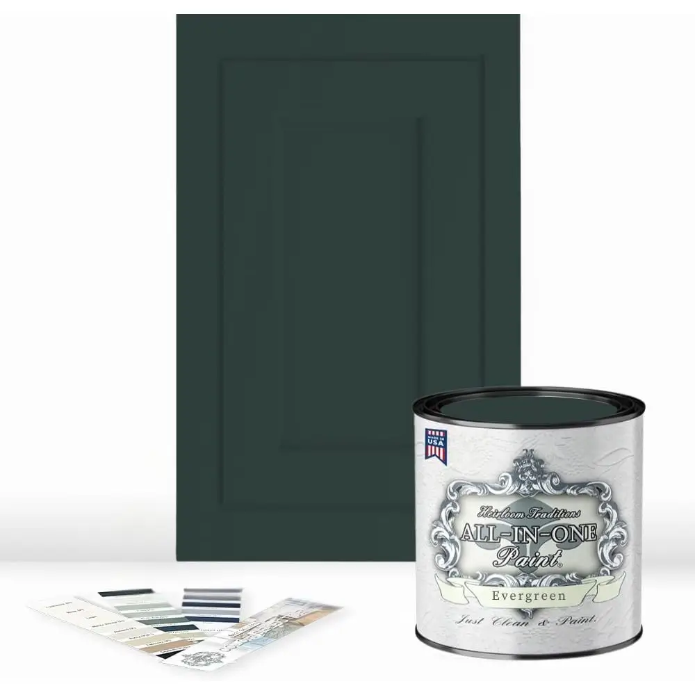
Some sage paints turn silvery in cool light.
Others show much more yellow at sunset.
Then there are the sneaky ones that looked softly botanical in the store and become pea soup beside your carpet.
This is why we sample.
You May Also Like:
→ 50 Bedroom Decorating Ideas This Year
→ The Bedroom Storage Rule of 3 to Turn Clutter Into Calm
→ The Bedroom Furniture Rule of 3
Warm Neutral Bedroom Colors That Don’t Look Flat
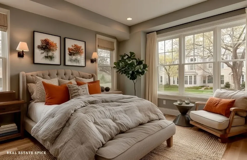
Neutral bedroom colors can be wonderfully restful, but neutral doesn’t mean colorless.
Cream, warm white, taupe, mushroom, sand, beige, and greige all carry undertones.
Some lean pink.
Some lean yellow, green, gray, or brown.
Those undertones decide whether the color works with your fixed finishes.
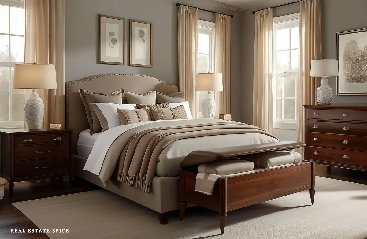
Start with the pieces you aren’t changing, such as the carpet, flooring, upholstered bed, dresser, or curtains.
Then choose a neutral that shares some warmth with those pieces.
This paint is perfect for a one-coat job. It goes on smoothly and dries quickly too!
A room with honey oak may look beautiful with cream, mushroom, or a gentle taupe.
Cool gray carpet may work better with a balanced greige or a soft off-white that doesn’t turn buttery beside it.
My warm neutral bedroom ideas will help you carry those colors into the bedding, furniture, rugs, lighting, and art you love.
Warm neutral bedroom colors also give you flexibility when you enjoy changing the bedding with the seasons.
You can bring in sage, blue, terracotta, blush, charcoal, or brown without repainting the room every time your favorite color changes.
If you want the room to stay simple without becoming plain, explore these simple bedroom interior design ideas.
These ideas will help you use furniture, texture, and decor more intentionally.
Dusty Blush and Muted Lavender for a Soft, Warm Bedroom
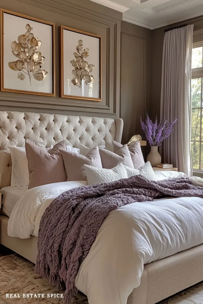
Not every calming bedroom color needs to come from blue or green.
Dusty blush and muted lavender can bring softness into a bedroom without making it look overly sweet.
In this room, the blush pillows and lavender throw add color while the cream bedding and taupe walls keep everything balanced.
Pair either shade with warm white, taupe, walnut, antique brass, or natural linen.
They can be especially lovely in a north-facing bedroom, where cool colors sometimes look dull.
Watch the saturation, which simply means how bright or intense the color looks.
A shade that looks soft on a small swatch can look much stronger across four walls.
If you love blush or lavender but aren’t ready to paint, try it first through pillows, a throw, curtains, or art.
You can enjoy the color without putting it everywhere.
Dark Bedroom Colors for a Cocoon-Like Room

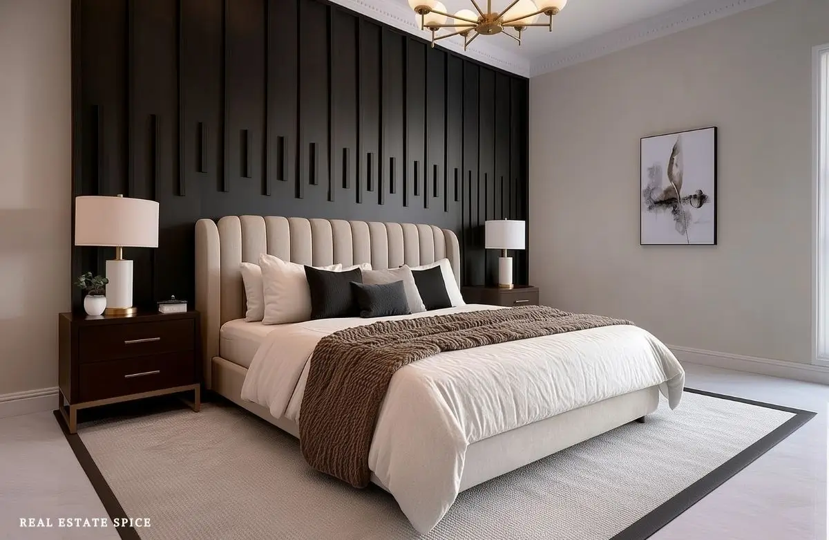
Charcoal, deep olive, brown, navy, and soft black can make a bedroom look protected and intimate.
They work particularly well when you enjoy a distinct nighttime atmosphere.
Dark doesn’t automatically mean restful, though.
A deep color can look harsh when it is paired with bright white bedding, one bare ceiling bulb, and no warm texture anywhere in sight.
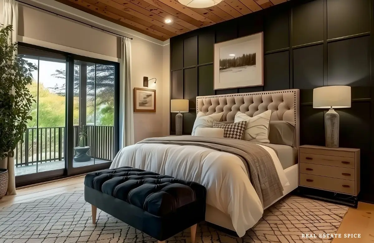
Soften it with layered bedding, warm lamps, full curtains, wood tones, a generous rug, and finishes that catch a little light.
You can also paint the trim and doors in the same color family for a more enveloping, cozy effect.
If that sounds like too much commitment, begin with the wall behind the bed.
One darker wall lets you see how the color looks in the room before the paint roller gets carried away.
What Are the Best Bedroom Colors for Sleep?
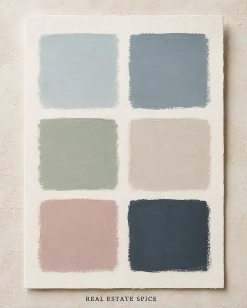
There isn’t one paint color that guarantees better sleep.
Sleep is affected by many factors.
A bedroom wall can’t do the work of a comfortable mattress, suitable temperature, darkness, or a routine that helps you wind down.
Color can still support the environment you want to create.
The best bedroom colors for sleep usually look comfortable to you in evening light.
They also don’t keep pulling your attention around the room.
For many people, that may be a soft blue, muted green, warm neutral, dusty rose, blue-gray, or deeper cocooning shade.
For you, it may be something completely different.
A major review of color psychology noted that color can carry meaning and affect responses.
It also cautioned that the evidence isn’t strong enough for sweeping real-world rules. Annual Review of Psychology
There you have it.
Use psychology as a helpful lens, not as a paint prescription.
If a creamy white bedroom makes you exhale and a blue room leaves you cold, choose the cream.
Your bedroom doesn’t receive bonus points for following a chart.
It does, for following your heart.
Your Internal State Shapes the Bedroom, Too

The bedroom affects you, but the relationship goes both ways.
You also shape the bedroom based on what you need, notice, remember, and prefer right now.
Maybe you decorated the room during a season when you wanted everything bright, busy, and energetic.
Now you want less contrast and fewer items and ‘noise’ in the bedroom.
Maybe you created a pale neutral room because it seemed safe, but lately you keep saving bedrooms with deep olive walls and warm amber lamps.
That doesn’t mean your first choice was wrong.
It may mean you have changed.
Sometimes you don’t need new furniture.
You need the bedroom to catch up with you.
Before repainting, notice what has been bothering you.
Is the color too cool after dark?
Does it look washed out during the day?
Does the room need more warmth, more depth, or less contrast?
Are you tired of the wall color, or is the real problem one bold comforter taking over the whole room?
That last question can save you a weekend of painting.
Try changing one large textile before changing the walls.
A duvet, rug, curtain, or upholstered headboard can shift the color balance enough to show you what the room was missing.
How Light Changes Calming Bedroom Colors
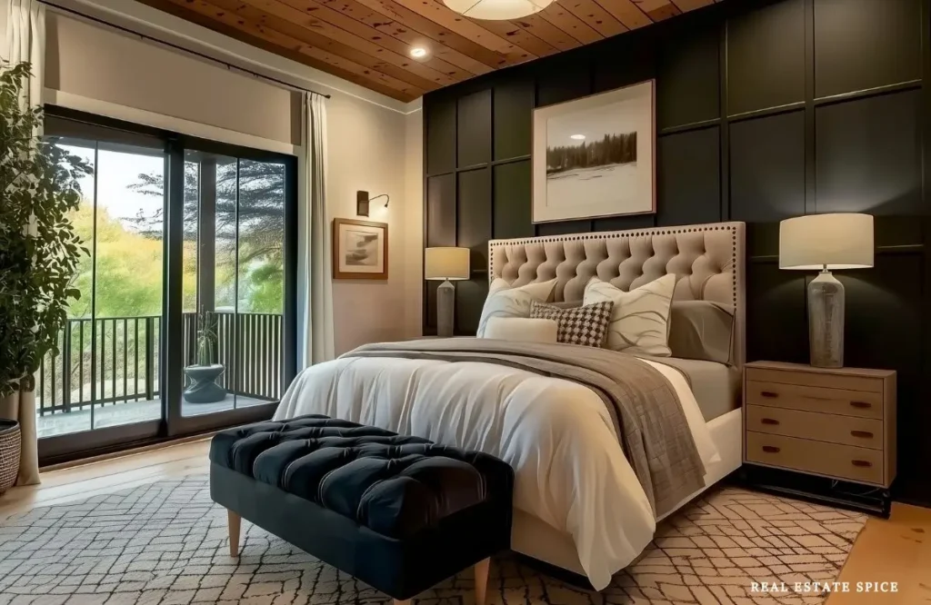
Light and color are inseparable.
A bedroom color is really several colors because it changes from morning to afternoon and again after dark.
East-facing rooms may receive warm morning light and look cooler later in the day.
West-facing rooms often become warmer and more intense near sunset.
North-facing rooms tend to have cooler, steadier light.
South-facing rooms may handle cooler or deeper colors because they receive more warmth and brightness.
Those are useful tendencies, not unbreakable rules.
Trees, neighboring buildings, window coverings, wall direction, and your location all affect the light that reaches the room.
Artificial light matters just as much because that’s often the light you use most in a bedroom.
A warm bulb may pull yellow or red undertones forward.
A cooler bulb can make gray, blue, or green more noticeable.
One overhead fixture can flatten a beautiful color and create hard shadows.
Bedside lamps, wall sconces, and gentle ambient light let the color develop more softly across the room.
Once you’ve chosen your color direction, the bedroom lighting rule of 3 can help you build the bedside, ambient, and mood layers around it.
Don’t choose paint under the brightest store lighting and expect it to behave the same way beside a warm lamp at ten o’clock at night.
Paint is not being difficult.
You’re simply seeing the same paint under different conditions.
Test Relaxing Bedroom Paint Colors Before You Commit
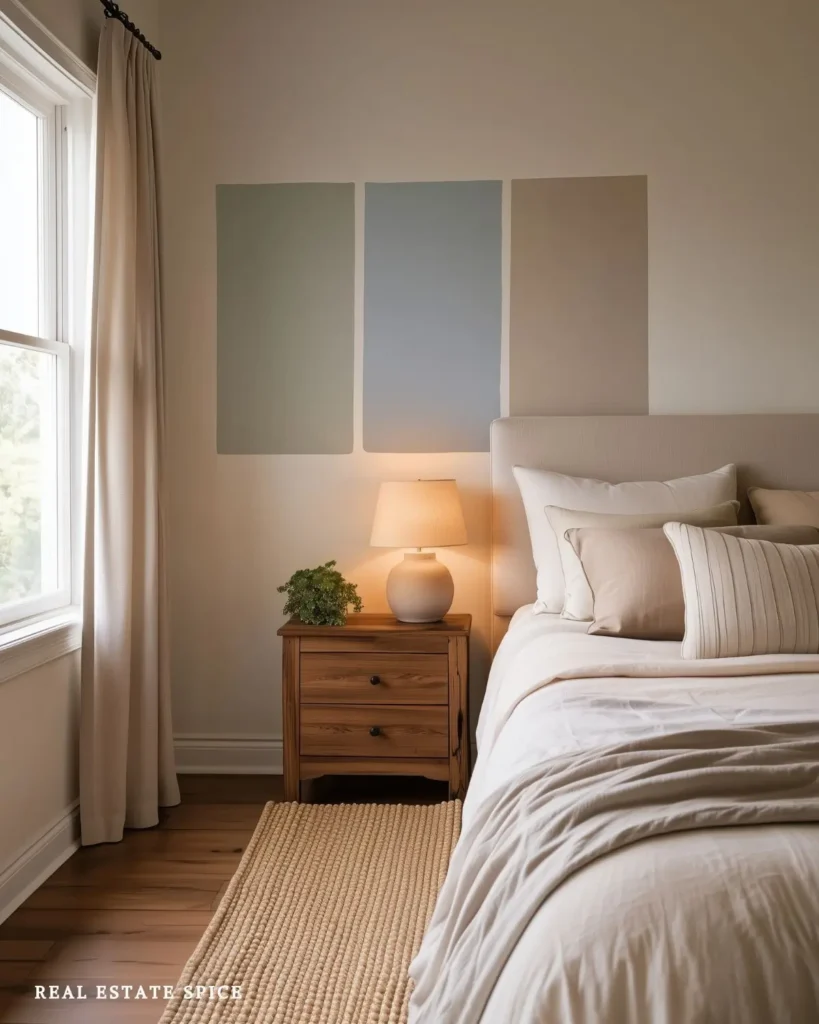
The most reliable color research happens in your own bedroom.
Start with several possibilities, then narrow them before covering every wall with little painted squares.
Once you have two or three finalists, use large peel-and-stick samples or paint large sample boards.
Small swatches make undertones harder to see and encourage you to judge the color in isolation.
Move each sample around the room.
Place it behind the bed.
Set it near the dresser, curtains, flooring, and any large upholstered piece.
JAYMIE’S PRO TIP
When Should I Check My Paint Samples?
Look in morning light, late afternoon, and with the lamps you use at night. If you rarely turn on the overhead light, don’t let it choose your wall color. Test the room as you actually use it.
Most of us avoid that switch like we avoid the person who turns on all the lights first thing in the morning.
Notice when the color looks best and when it changes in a way you don’t like.
One awkward hour doesn’t always ruin a color.
But if you use the bedroom during that hour every day, it matters.
Photograph the samples if it helps you compare them, but don’t make the final decision from your phone.
Phone cameras can change the color quite a bit, so don’t choose paint based on a photo alone.
Live with the samples for several days.
Look at them when the room is tidy and when real life is spread across the bed.
Put the bedding back against them.
Turn on the lamps.
Close the curtains.
If you keep coming back to one color and still love it, you may have found your answer.
Keep a Calming Bedroom Color Palette From Looking Flat
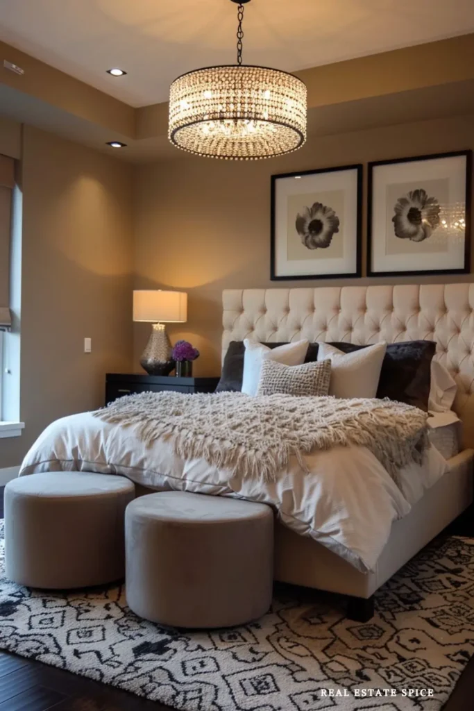
A restful bedroom still needs enough contrast to keep it interesting.
The answer isn’t adding five more colors.
Instead, use changes in texture, value, and material.
In a cream bedroom, layer ivory bedding, a taupe throw, warm wood, woven shades, and one dark detail.
In a sage bedroom, combine cream, olive, oak, linen, and a little black or brass.
In a blue-gray room, add camel, walnut, ivory, and textured white.
The colors stay controlled while the materials prevent the room from looking unfinished.
This is also where cozy bedroom ideas become useful.
Soft bedding, curtains, rugs, pillows, and warm light can give a simple palette the depth paint alone can’t provide.
Once you choose your main color, use the bedroom color rule of 3 to decide where the wall, bedding, and accent colors belong.
That’ll help you place colors.
This article helps you choose the direction in the first place.
Bedroom Color Mistakes That Make It Harder to Unwind
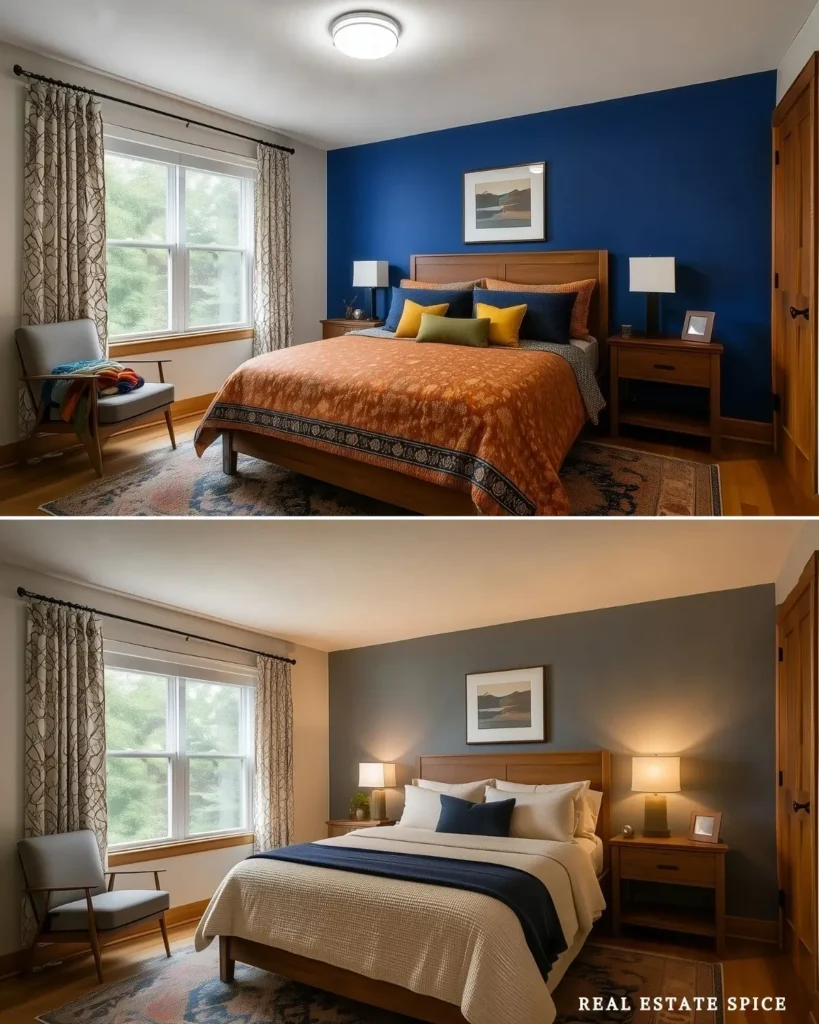
The first mistake is choosing a color because it’s described as calming, even though you don’t like it.
No amount of color psychology will make you enjoy a green that reminds you of canned peas.
The second is choosing a color from a paint swatch elsewhere without testing it in your own room.
Online images are wonderful for finding a direction, but light, camera settings, filters, and editing can change what you see.
THE 30-SECOND ROOM CHECK
What Is the Paint Color Joining?
Look at your flooring, furniture, bedding, curtains, and rug. They aren’t moving out when the paint can opens, so your new wall color needs to look good beside them. Judge the whole room, not one swatch.
The fourth is judging paint only during the day.
If you spend most of your bedroom time at night, pay close attention to how the color looks in evening light.
The fifth is making every color equally strong.
One deeper wall, a warm neutral bed, and a smaller accent are easier to settle into than several bold colors competing across the room.
The sixth is expecting paint to fix the entire bedroom.
Color can help the environment, but comfort, clutter, lighting, temperature, noise, and daily habits still matter.
A wall color can only do so much when the mattress is uncomfortable, the chair collects laundry, and the room has one harsh overhead light.
For a room-wide plan, these calm bedroom designs bring color together with lighting, furniture, storage, and comfort.
Calming Bedroom Colors That Make the End of Your Day Feel Better
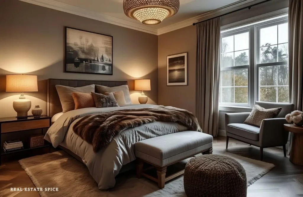
The right bedroom color doesn’t need to impress you every time you walk past the door.
It needs to work with your light, furniture, bedding, and the way you use the room.
It can make warm wood look richer, soften dark furniture, give pale bedding more depth, or help the entire room look less visually busy.
Most importantly, it should be a color you still enjoy at the end of the day, when the lamps are low, and you’re settling in.
Choose the bedroom experience you want.
Pay attention to the colors that help you relax.
Test your favorites in the room using the Three-Light Test.
This paint is perfect for a one-coat job. It goes on smoothly and dries quickly too!
Then let the wall color, bedding, and accents work together instead of asking one paint chip to perform a small miracle.
When the color is settled, use these relaxing bedroom sanctuary ideas to complete the room.
They’ll help you add lighting, comfort, texture, and the details that help you unwind.
The right bedroom color doesn’t tell you how to feel.
It gives your eyes less to fight with and helps the room support the way you want to settle in.
At the end of the day, you can lower the lights, pull back the covers, and feel the whole bedroom soften around you.